Horizon.
Being part of a photography group on Facebook has its ups and downs. You can share your best photos with total strangers and receive some positive feedback (something otherwise impossible unless you are a professional photographer). The problem is that most people in the group are amateurs. And they can be really touchy if your comment on their photo is less than encouraging. I made a comment regarding some lady's composition and the horizon of the photo being 'crooked'. She completely misunderstood me: "You obviously have no idea what you're talking about and have never been to Tasmania". Wow, no. I've never been to Tasmania. Our ancestors were right. Earth is flat and Tasmania is at the end of the world and the horizon is slanted right there! I wouldn't want to be close to those waterfalls that lead you to doom. Case in point, I couldn't resist but dissecting the photo in question:
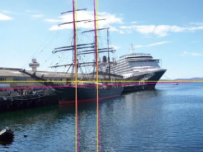
The yellow line represents the correct horizon line, based on the mountains in the background. Based on the horizon line right below the mountains, not the mountains themselves! Of course mountains are crooked, even in Tasmania. I added a couple of vertical lines close to the clipper masts so yo can see that they are slightly tilted to the left. The magenta lines represent the actual horizon of the photo, crooked, tilted, slanted —5º to be exact—.
Furthermore, if I extend the vanishing points of the wharf (pink dotted line) and the cruise boat coming from around of it (blue dotted line) you can see that the end points are not aligned to the correct horizon (green line).
So, the only way to fix it would be to rotate the image some 5º to the left, therefore needing to crop some of the image (represented by the yellow area). The result would be much more pleasing even in terms of composition since all the water underneath adds nothing to the photo —at least not in this particular photo, you either show a lot of water or little but it is too undefined the way it is—:
You're welcome!


Comments
Post a Comment